


Although YouTube's design has been updated over many years, there have been no major changes for a long time. However, now the online video service is testing a more radical update that shifts many elements to the side panel. The reaction to this has not been very approving so far.
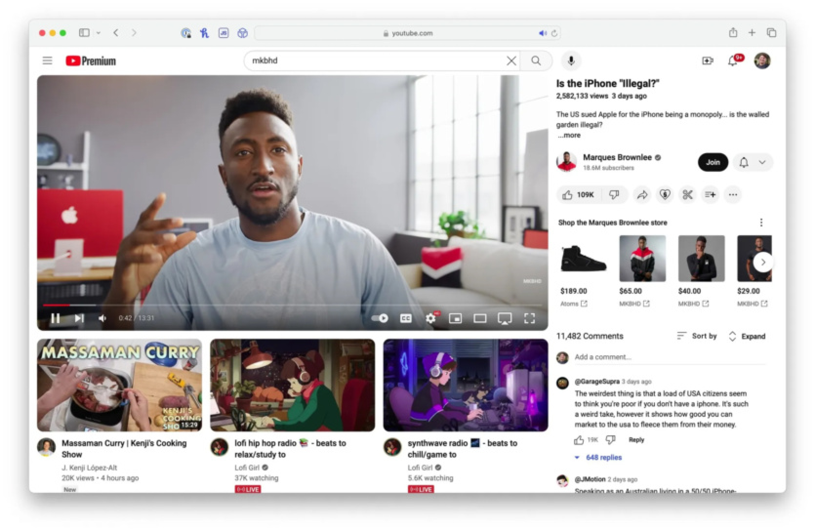
Over the past few days, many YouTube users have noticed a completely new site design. The video description below the video player has moved to the right side of the screen, along with the comments. Recommended videos are now placed where the description used to be, and there are many more of them.
The title is also impossible to find in its usual place; it has shifted to the side. Thus, the playable video and recommendations are almost not separated at all. Previously, recommendations were displayed in the sidebar, while the title, description, and comments were below the video.
Users have generally negative feedback to the changes. YouTube has even been compared to some other sites with interesting videos. However, there were also more balanced comments:
"I understand that people don't like changes, especially significant ones like this, but isn't this MUCH better for usability? Now I can read the description and interact with the comments without scrolling through the video."
YouTube has confirmed that this is just a test for now. It is quite widely available, but not for everyone yet. Considering the feedback, it is quite likely that this design will not make it to the finish line. YouTube users can officially provide feedback on the updated site.
Source: 9to5google


Comments (0)
There are no comments for now