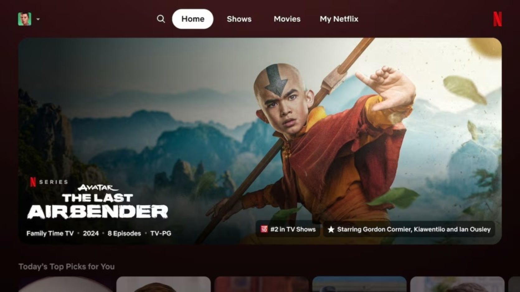
Netflix has started rolling out its first major TV app update in a decade. The proposed interface changes are aimed at helping viewers quickly decide what they want to watch.
The streaming service aims to increase the time viewers spend in the app to retain customers and attract subscribers to their new, more affordable ad-supported plans.
The company's research showed that users were performing what's known as "eye gymnastics" - moving their gaze across different parts of the Netflix main screen, trying to find the content they were interested in. Therefore, in developing the new interface, designers tried to eliminate the need to constantly shift focus.
"We really wanted to make it easier, more intuitive, easier to navigate overall," said Netflix's CEO Pat Fleming.
Changes to the homepage included increasing headlines, reorganizing information, and highlighting easy-to-read tidbits, such as series or movies that have "spent 8 weeks in the top 10."
Among other changes in the TV app, the menu button was moved from the left to the top of the screen. A new My Netflix tab was added with series or movies that the user has started watching or saved to watch later.
At the same time, Netflix will continue to provide personalized recommendations to each user. The service will not make any changes to its recommendation algorithm as part of the redesign, Fleming said.
The updated version of the Netflix interface has already started to roll out to a subset of nearly 270 million users worldwide. The company will gather feedback and may make changes before implementing the updates more widely.
Netflix emphasizes the duration of interaction as a key metric, telling investors that it is the "best indicator of customer satisfaction."
Source: reuters


Comments (0)
There are no comments for now